
Soooo…what do YOU think? Does it make you laugh, squint, cringe? It’s always exciting to see Pantone’s color selections and consider how the emotion behind them tell us a little more about how we’re doing on just about all levels, whether personal, community, national and even global. The Honeysuckle of 2011 is “decidedly pink with a dash of red artfully mixed in.”
“A color for all seasons: Courageous. Confident. Vital. A brave new color for a brave new world.”
In times of stress, we need something to lift our spirits. Honeysuckle is a stimulation, captivation color that gets the adrenaline going–perfect to ward off the blues. -Leatrice Eiseman, executive director of the Pantone Color Institute
 When you’re passin’ by….flowers drop and sigh
And I know the reason why
You’re much sweeter….goodness knows
Honeysuckle rose
-Louis Armstrong
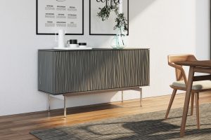
Entry/Living - upbeat & dynamic
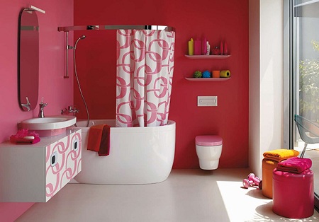
Dining/Kitchen - stimulates appetite & conversation


Bedroom/Bathroom - revitalizing & cheerful


