“The best color in the whole world, is the one that looks good, on you!” – Coco Chanel
And so, what is “your” color? I remember when I had to consciously change my purchasing pattern of buying blue. I realized one day standing in my closet that nearly every item of clothing I had was in some shade of blue. No doubt blue’s a fantastic color, but obviously I was in a rut. Slowly my closet began to put off an air of a little more creativity and daring.
Is your home in a rut? Too much beige…blah…blah…blah. Here’s some Hot-Off-The-Press industry info on the color forecast for 2009:
For Optimism, Warmth & Energy
YELLOW with a touch of green, aka a zesty citron yellow, projects freshness, sophistication and intimacy as well as optimism. It’s the hint of green that will make your yellow compatible with other hues, creating excitement and synergy. For a dazzling effect, team it with Peony, a fuchsia hue in the trendy red-violet family; or for a cheerful, lower-contrast look, with a softer version of itself that goes a little more green. This same yellow will take on a rich, complex look when you pair it with browns and blacks; or pair it with a steel gray to achieve a chic, yet dreamy atmosphere. Yellow can be applied in these ways to define a relaxing yet energizing environment.
Comfort Colors
PURPLE is still as in-demand as it was last fall. Look for red-violets such as plum, or bluer-influenced fuschias. Grayed violet works great as a neutral.
BLUE is “the new green.” No matter the shade of blue, if it’s found in nature it represents our ecological awareness as individuals and as a society.
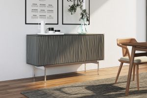
GRAY/GRAY-BROWN-Not heavy like black, but also not as warm-toned as brown. These hues satisfy our urge for classic style in challenging times.

WHITE, afresh and anew in practical, cleanable finishes. Representing purity in thought, motive and result: use it in your business to portray a message to your clientele. And here’s an idea: mix up contrasting white finishes like matte or textured vs. glossy and smooth.
EXOTIC JEWEL TONES: Saturated hues of oranges, reds, yellows, turquoises & teals are becoming more familiar in American homes in 2009 & offer a beautiful pallet of inspiring colors from such destinations as India, China & Turkey.
MAUVE-?!? What? Can you be serious? Absolutely. First formulated in the Victorian era, this comeback from the ’80s is 2009’s surprising new neutral. Look for it mixed up with those EXOTIC JEWEL TONES and mauve is reborn…again.
Ecology
“Environmental awareness is becoming a status symbol. Conscious Luxury shows how being ‘green’ can be chic.” – Jackie Jordan, color marketing director, Sherwin Williams
People are doing more to bring elements of the outdoors indoors. These colors are on the table for 2009, symbolizing an awareness and appreciation for the immense beauty of our planet Earth and the wonder of all creation.
BLUE: Royal, sky, and violet-tinged hues invoke water and air.
PURPLE: Plums and shades that show a bit of red and REDS with a hint of orange or grown-up pink are influenced by Latin American botanicals. In the same family, RUBY & ROSE incite the romanticism of gardens & jewels. Neutral tones that go warm, like WOOL, MESA, & UMBER take their cue from nature; cool GREY is a more modern neutral that solidifies the strength of stone and steel, and the mystic of fog and storms.
Works cited: Ryan, Mary Wynn. “Color Comes to the Rescue.” NHFA Home Furnishings Retailer. Jan. 2009: Volume 16 Number 1.